Let’s Talk Real First…
You ever land on someone’s Instagram or website and just feel that they have it together?
The colors vibe. The font feels intentional. The whole thing looks pro without trying too hard.
Now flip that…
You click someone else’s profile and it’s a mashup of neon pinks, clashing fonts, Canva chaos, and zero consistency. It doesn’t make them look bad, but it does make them look… scattered.
That’s the quiet power of visual identity — it speaks before you do.
And here’s the good news:
You don’t need to hire a designer to create something that feels professional and on-brand. You just need to make a few clear choices and stick to them.
What is Visual Identity?
It’s how your brand looks and feels across everything you put out:
• Your website
• Your social feed
• Thumbnails, graphics, banners
• Even email signatures and client PDFs
It’s your colors, your fonts, and your layout style — and when done right, it helps people recognize you instantly (and take you more seriously).
Mini Action Break #1: What Should Your Brand Feel Like Visually?
Before we talk colors and fonts, you need a feeling to aim for.
Ask yourself: How do I want people to feel when they interact with my brand?
Pick up to 2 emotions or moods from this list (or add your own):
| Emotion / Mood | Examples |
|---|---|
| Bold | Strong, confident, edgy |
| Minimal | Clean, modern, uncluttered |
| Artistic | Playful, hand-drawn, creative |
| Cinematic | Dramatic, moody, high contrast |
| Warm | Inviting, earthy, approachable |
| Futuristic | Techy, sharp, neon-based |
Write these down. You’ll use them in the next steps to shape your color and font choices.
Choose Your Color Vibe
Color influences trust, mood, and action. But most creators pick colors based on “what looks cool” — not what supports their message.
Here’s a shortcut: choose 1 base, 1 accent, and 1 neutral that reflect the vibe you just picked.
| Color Role | Purpose | Examples |
|---|---|---|
| Base | Your anchor color | Deep blue, black, tan |
| Accent | Pops of energy for buttons or icons | Orange, teal, pink |
| Neutral | Used in backgrounds, text | White, off-white, grey |
Mini Action Break #2: Build Your Color Trio
Pick one of each:
• Base: __________
• Accent: __________
• Neutral: __________
If you’re unsure, you can explore color combos at coolors.co or colors.muz.li.
Pick Your Font Personality
Fonts are sneaky. They carry tone before you even read the words. So what you choose matters — and it only takes 2 fonts to look pro.
Rule of thumb:
• Headings: Something bold, clean, and character-rich
• Body text: Something easy to read, neutral, no fluff
Here are Google Font pairings we love:
| Heading Font | Body Font | Use Case Style |
|---|---|---|
| Montserrat | Roboto | Bold + modern (cinematic) |
| Poppins | Lato | Clean + minimal |
| Bebas Neue | Open Sans | Edgy + streetwear vibe |
| Playfair Display | Source Sans Pro | Elegant + lifestyle brand |
Mini Action Break #3: Lock In Your Fonts
Choose:
• Heading Font: __________
• Body Font: __________
You can preview all of them free at fonts.google.com
Bonus Tips for Layout Vibes
Even spacing, aligned sections, and consistent margins go a long way — especially in things like IG carousels, site design, or landing pages.
Quick layout guidelines:
• Keep your logo in the same corner/location every time
• Use the same heading size/style across platforms
• Don’t go font crazy — 2 is enough
• Keep your CTA buttons the same color + shape for recognition
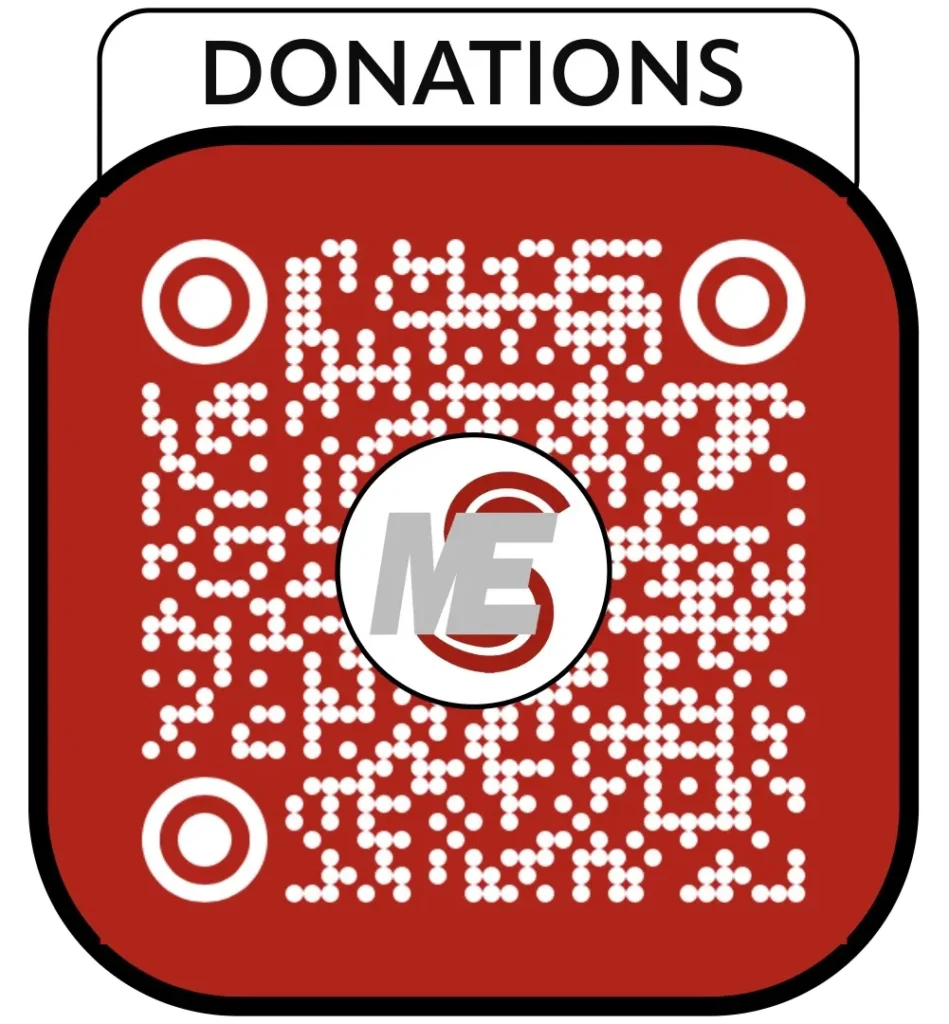
If this blog has been helpful buy us a cup of coffee. Will keep them coming donate what you want (minimum’s $2) Scan QR code Donate with strip.
Download the Visual Identity Builder
We made it plug-and-play template to:
• Define your colors and fonts
• Build a mini brand board
• Use as a style reference for yourself or collaborators
[Download Chapter 2 the Visual Identity worksheet]
Coming Next:
Chapter 3: Content Pillars — Never Run Out of Ideas Again
Define 4–6 timeless themes that make posting feel effortless (and strategic).


Leave a Reply